01Who they are
Corporate Capital is a financial firm, and Brent — one of the owners — delivers a presentation that's central to how they win business.
02The challenge
The existing deck was already converting, but information-dense and hard to follow, with a generic design. When a deck is doing that much lifting, "good enough" leaves conversions on the table and makes it harder to deliver than it needs to be.
03What I did
Rebuilt for clarity and impact — cut the density, restructured so the audience can follow the argument, redesigned to look sharp instead of generic. Not changing what worked; making it easier to see and easier to give.
04The outcome
Brent's been thrilled, and says it's noticeably easier to deliver. Same proven message, clearer for the audience and smoother for the presenter.
Before / After
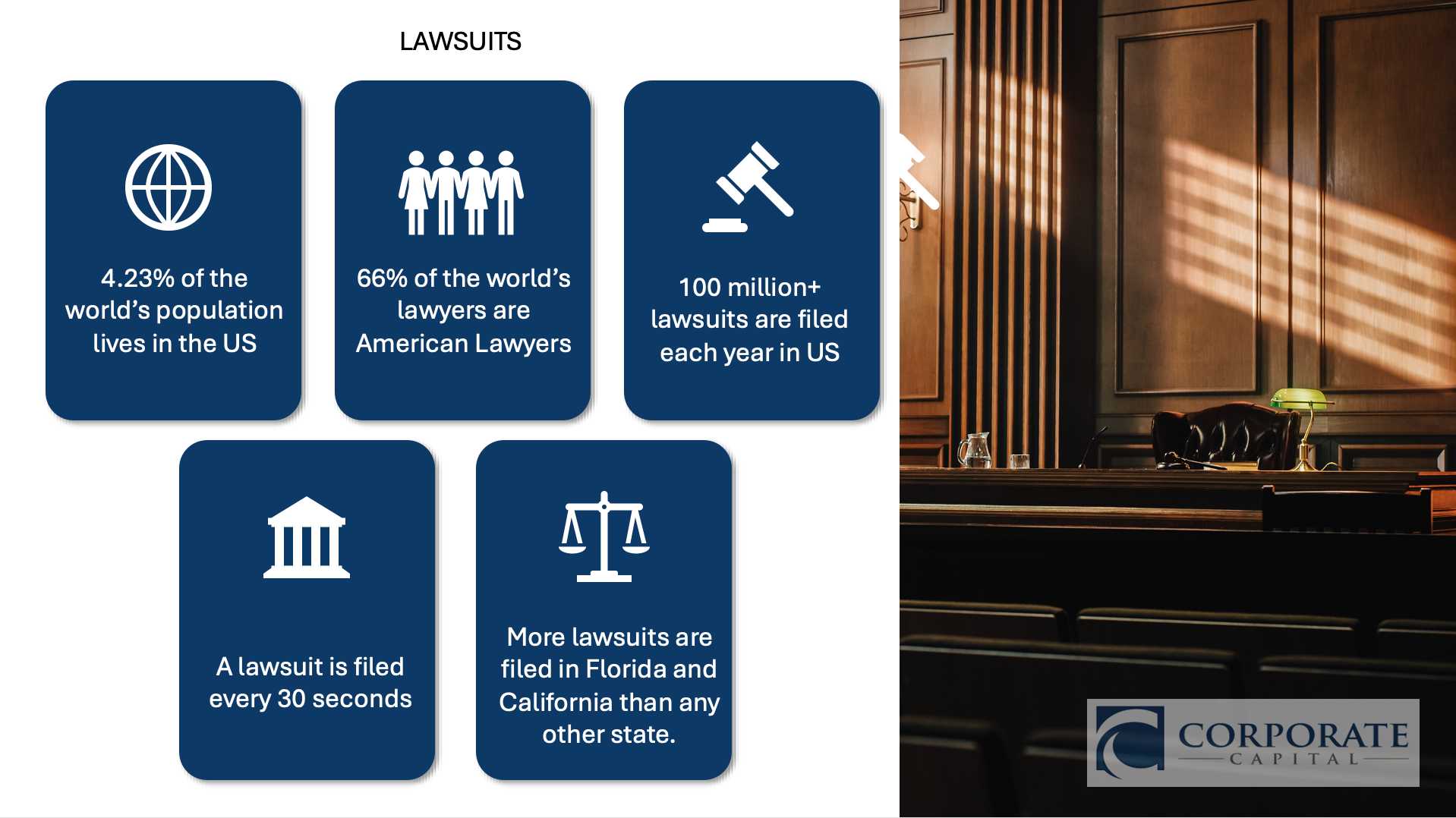

Same content, rebuilt — clearer structure, stronger visual hierarchy, and a design built for the stage.